Uppercase Wordpress Theme - Rating, Reviews, Preview, Demo & Download
Theme Description
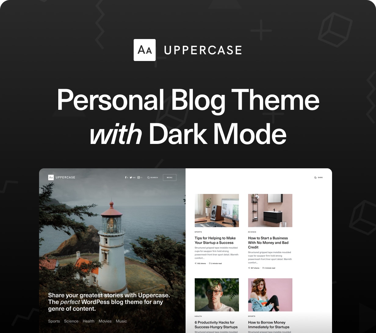
Uppercase. WordPress Blog Theme with Dark Mode
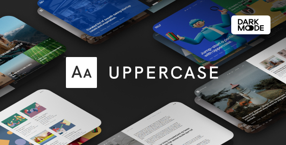
Uppercase is a modern and clean WordPress theme for modern content-based blogs and magazines.
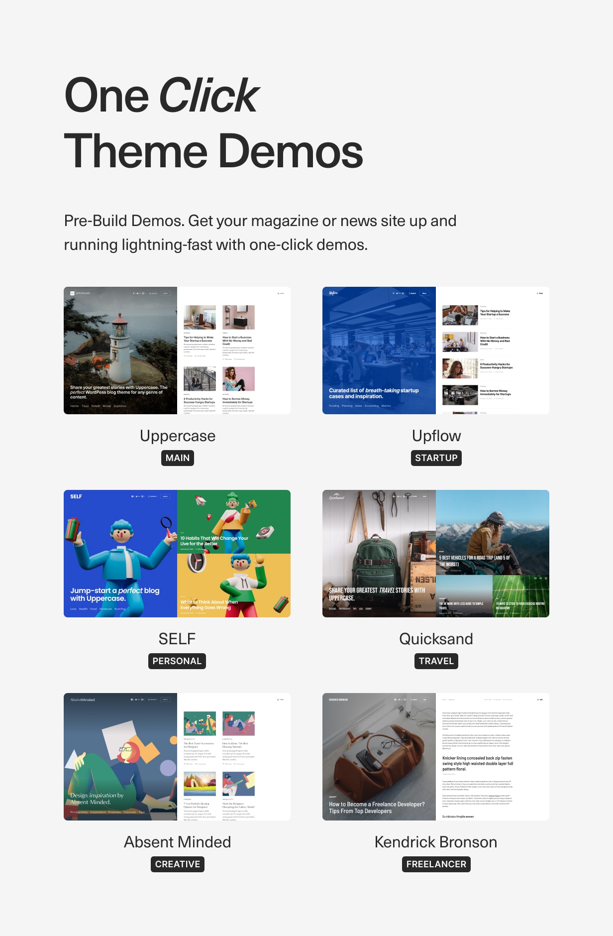
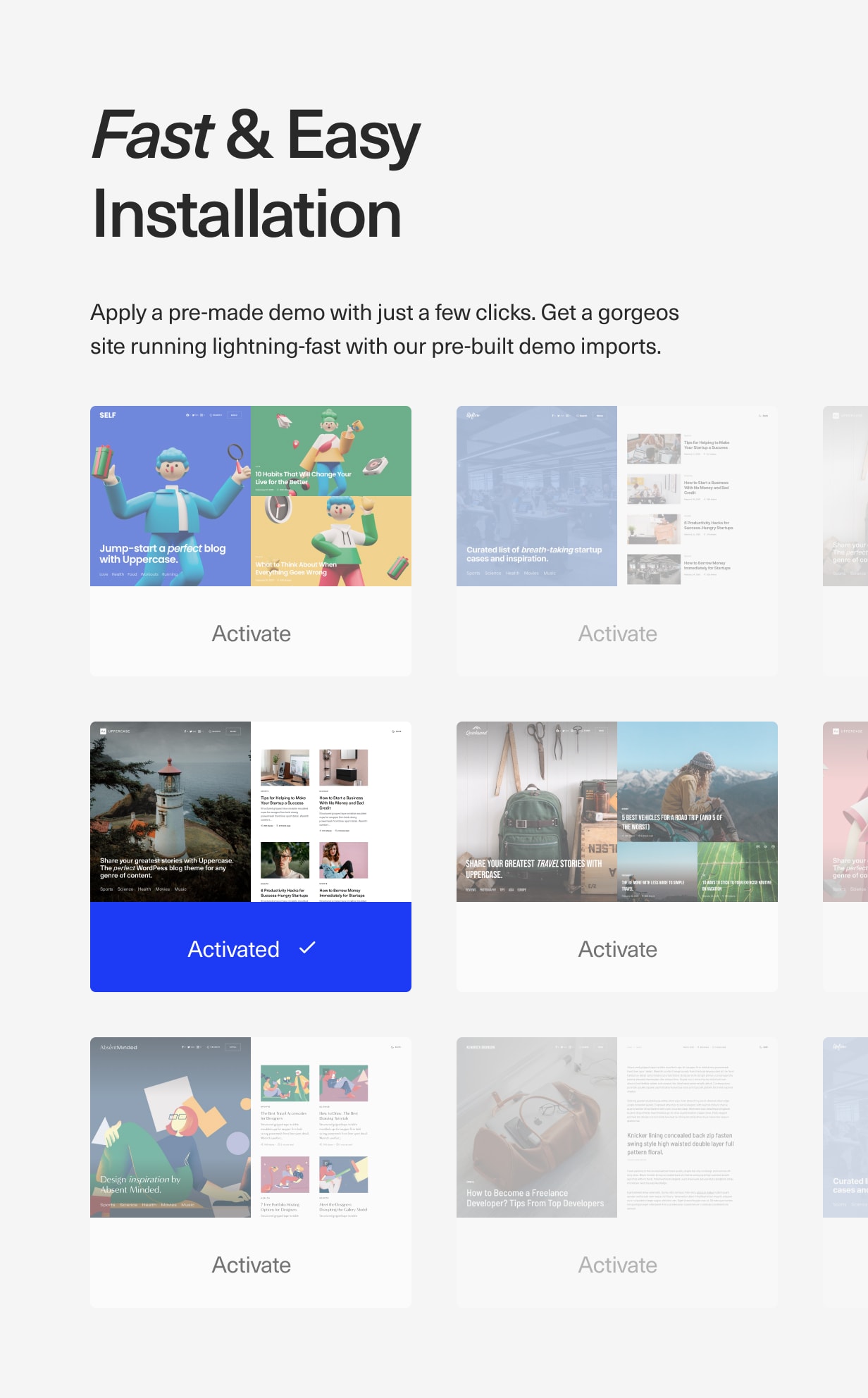
9 Beautifully Designed Demos in One Theme
Thanks to our signature feature, the Demo Switcher, you may apply a new demo any time without affecting your content. If you feel bored with one of the demos, simply apply a new one and get a completely different appearance of your blog or magazine.
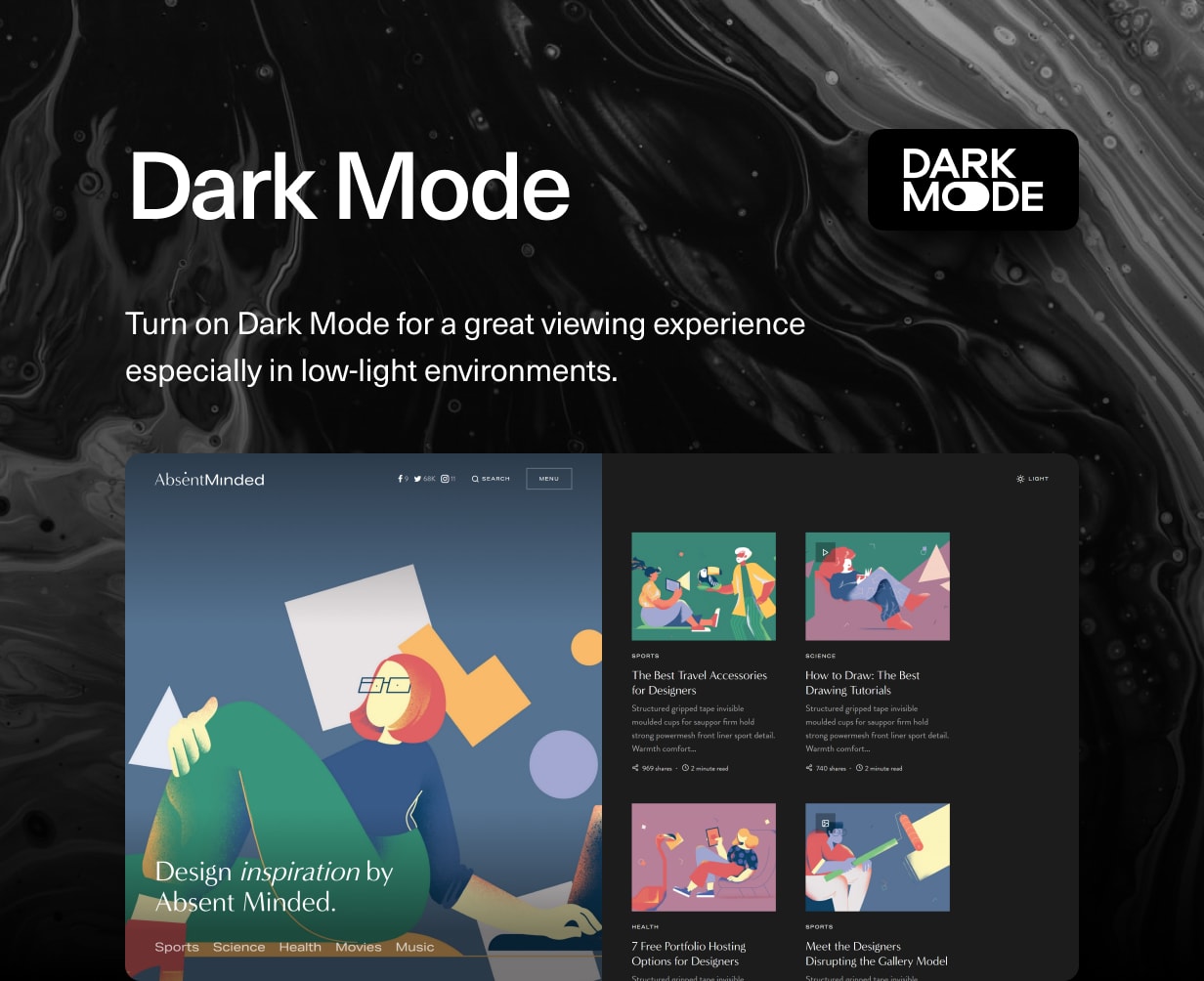
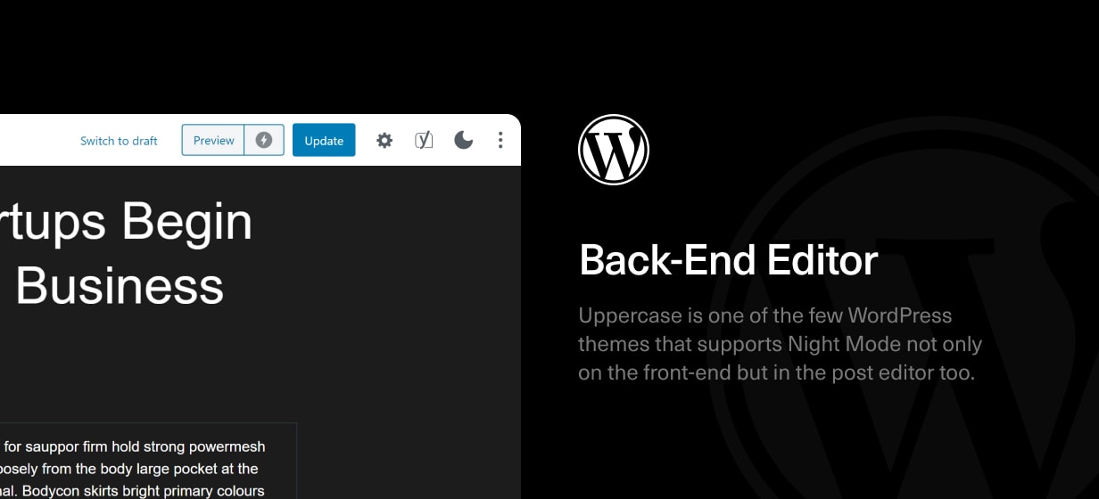
Dark Mode
Turn on Dark Mode for a great viewing experience especially in low-light environments.
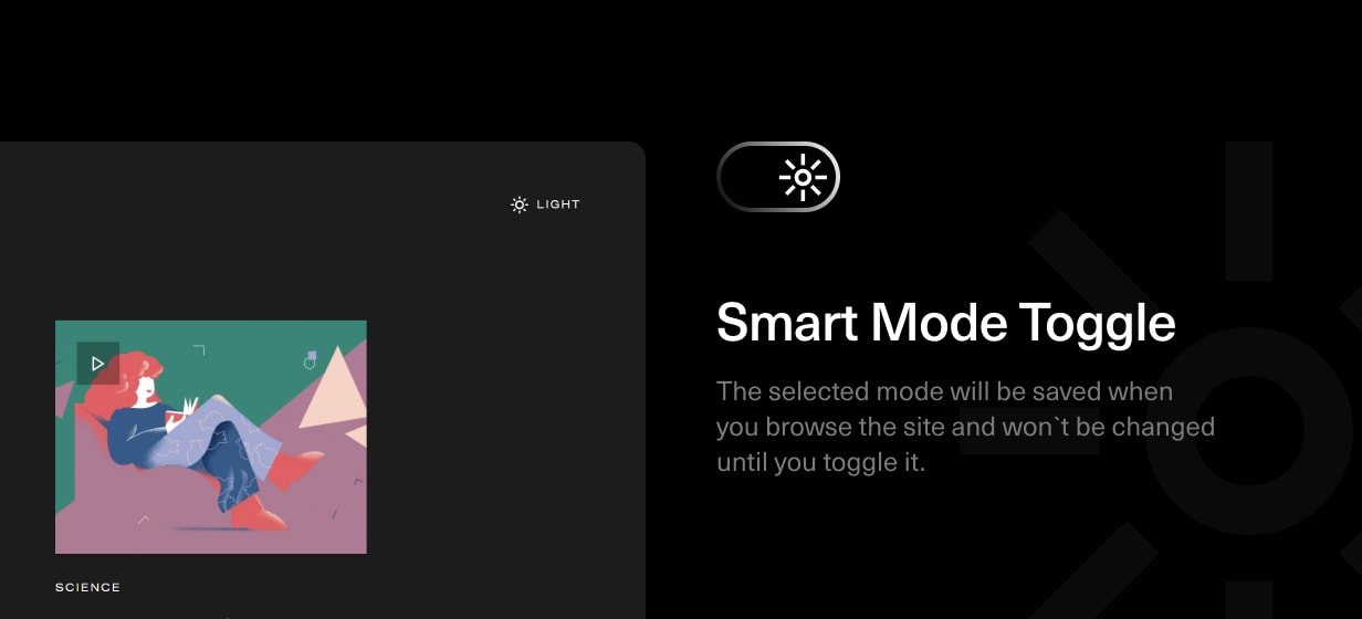
Dark Mode is a dramatic new look that’s easy on your eyes and helps you focus on the content. It uses a dark color scheme and is activated automatically based on the browser’s preferred settings or manually with a toggle.
Turn on Dark Mode to give your eyes a break.
Multiple Page Header Types
There are three different page header types for your posts and pages. Display your featured posts’ header with an image overlay or a smaller page header.
Smart Colors
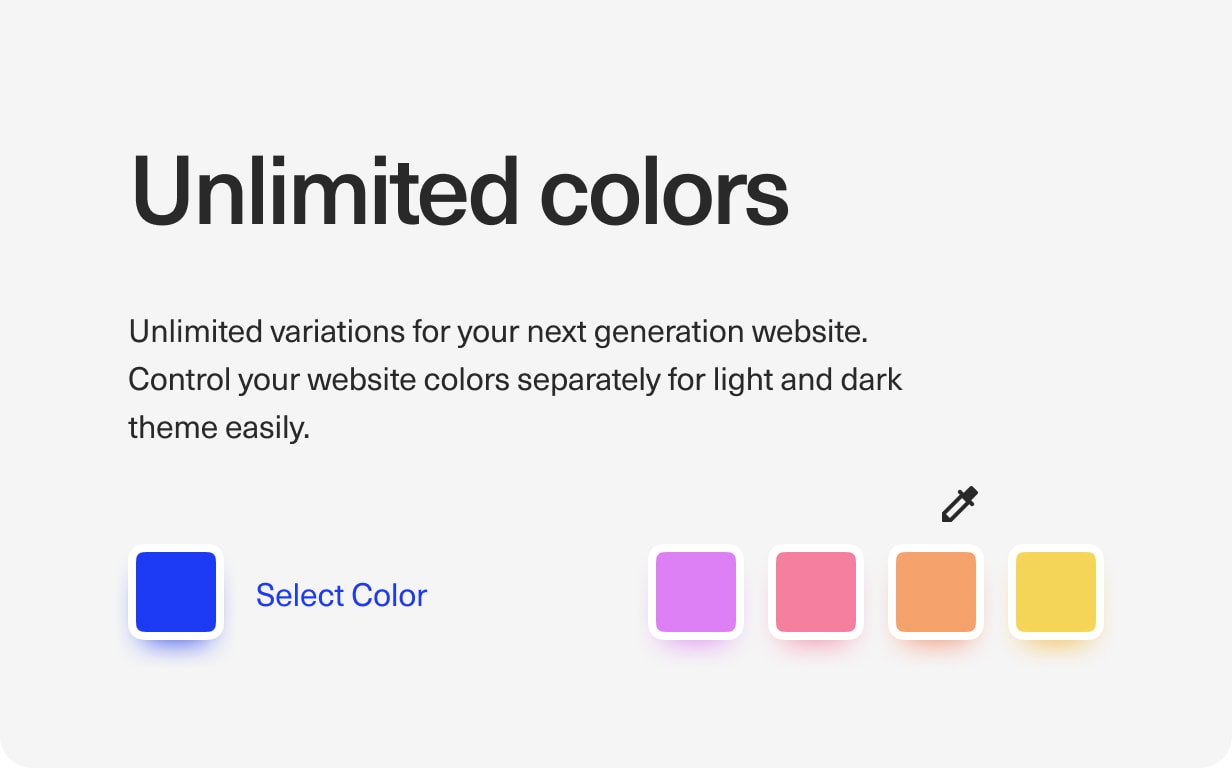
When you select a dark background color for your header or footer, the text and links color will automatically change to white. You don’t need to set up a lot of color option, as most of them will work automatically based on your selection.
Customize with Instant Live Preview
All theme options can be configured with the native WordPress customize feature. Forget the outdated settings pages and manually refreshing your page to see the changes. Preview all the changes live while configuring your perfect blog or media.
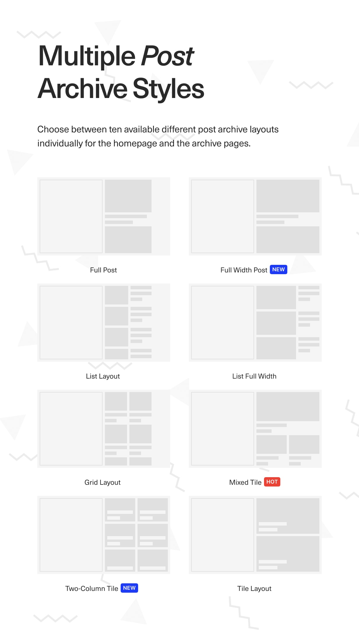
Multiple Archive Layouts for Homepage and Archive Pages
Choose from different post archive layouts for your homepage and archive pages. Display your posts in grid, list, or full layouts.
Multiple Page Layouts
Select the matching page layout for your homepage, archives, posts, and pages. Display a sidebar on either the left or right side or use the full-width page layout for your content.
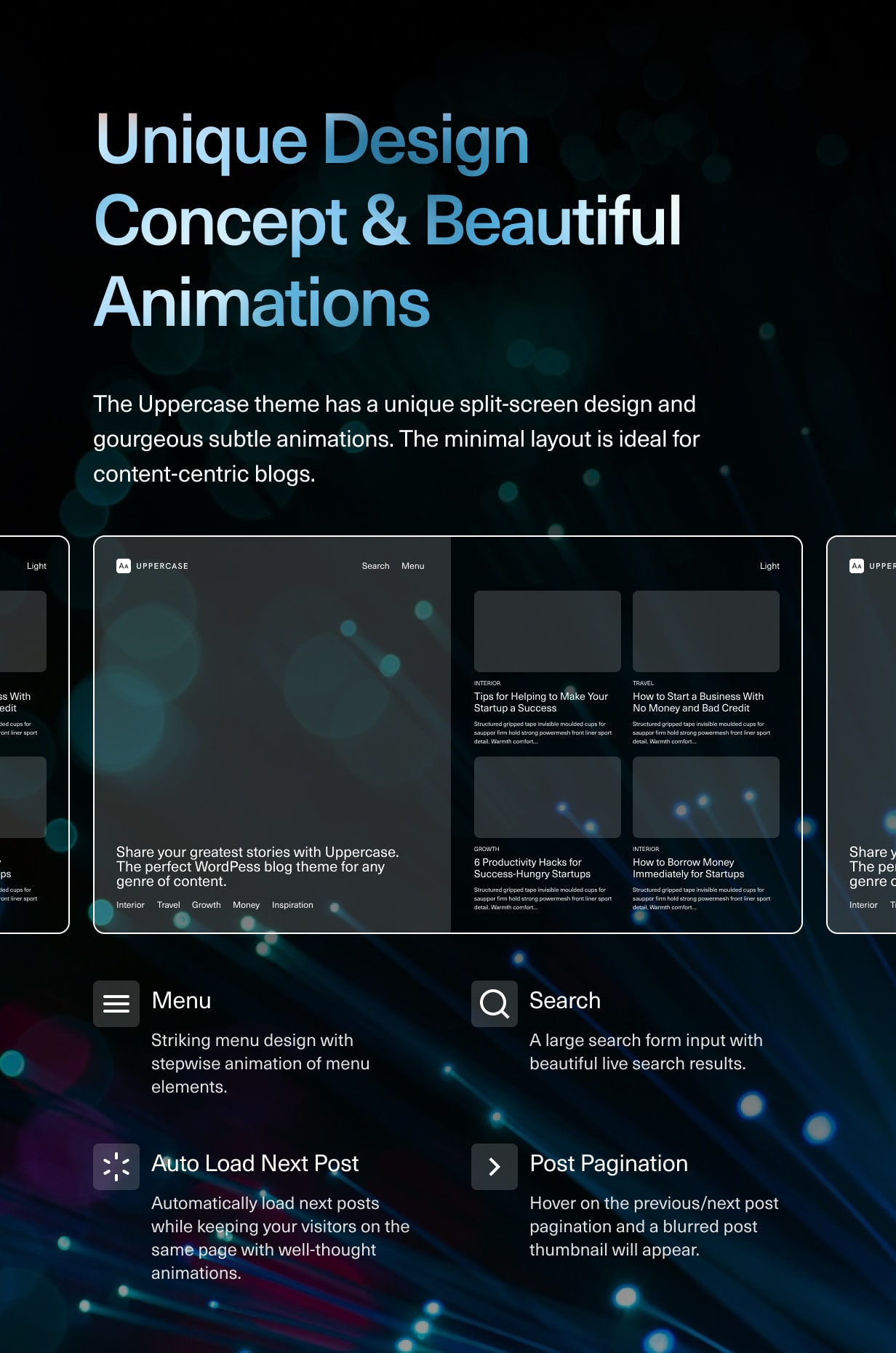
Super-Fast Mega-Menu
Showcase your recent posts with a thumbnail right in the menu dropdown. Don’t worry, the menu will not slow down your website, as the content is requested dynamically, only when a user hovers over the parent menu item.
AMP Support
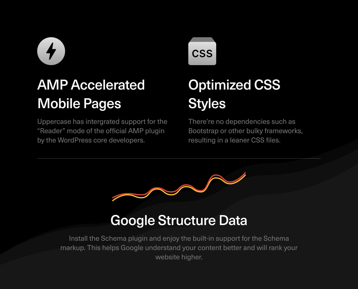
We have added styles for the AMP pages to match the main styles of your website. Simply activate the official WordPress AMP plugin to enable Google Accelerated Mobile Pages on your website.
Exclude Duplicate Posts
Everybody knows, and Google, in particular, that duplicate content is bad. Avoid having duplicate content on your homepage by excluding featured posts from the main archive with a single click.
Google Fonts
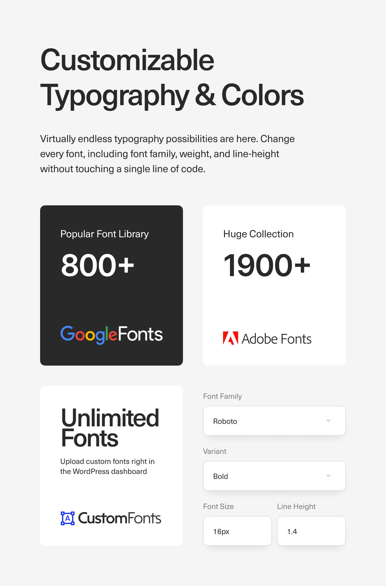
Create different styles with 800+ Google Fonts supported. Simply select the desired font from the dropdown and preview it instantly on your website – no more confusing CSS rules or code snippets.
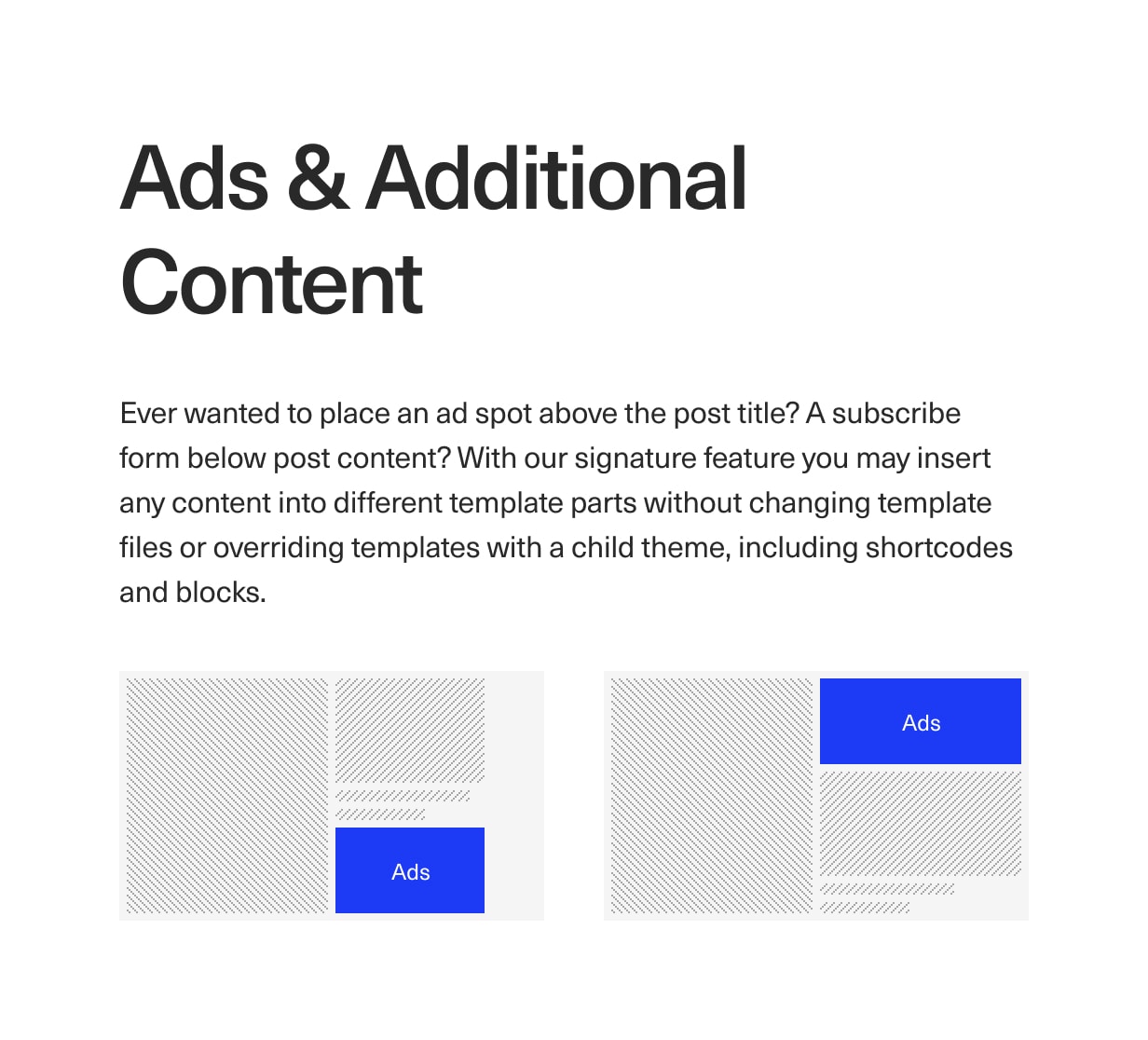
Additional Content
Ever wanted to place an ad spot underneath your header? Or a short description before the featured posts section on your homepage? A subscribe form below post content? With our signature feature you may insert any content into different template parts without changing template files or overriding templates with a child theme.
Smart Sticky Navigation
Increase mobile users’ viewport by displaying the main navigation only when they scroll up. Or force the menu to stay sticky all the time. Or disable the feature completely, it’s up to you! Enable either of the three options in theme settings with a single click.
Sticky Sidebar
Make your widgets sticky when scrolling the page. Select from two options: either stick to the bottom edge of your sidebar or the top edge of the last widget. Increase your ad’s conversion by setting the ad as your last widget and selecting the latter option. Unlike other theme’s sticky sidebars, ours is enabled and doesn’t flicker on tablets or mobiles. By using the native browser’s sticky positioning, we created a sticky sidebar that animates gorgeously not only on desktops but mobiles too.
Smart Multi-Level Menu
It’s you who decides how to structure your content. Our theme supports unlimited levels in your main menu. If there’s not enough space in the viewport to display a dropdown submenu, it will appear on the opposite side instead. And it supports mobile touch devices, too.
Mobile Slide-Out Menu with Widgets
Display the mobile menu upon clicking the hamburger icon on mobile devices. You may also place social links, subscription form, Facebook fan page or any other widget on your mobile menu, just as in a regular sidebar.
Paginated Posts
Divide your posts into multiple pages and add properly styled pagination at the bottom of your posts.
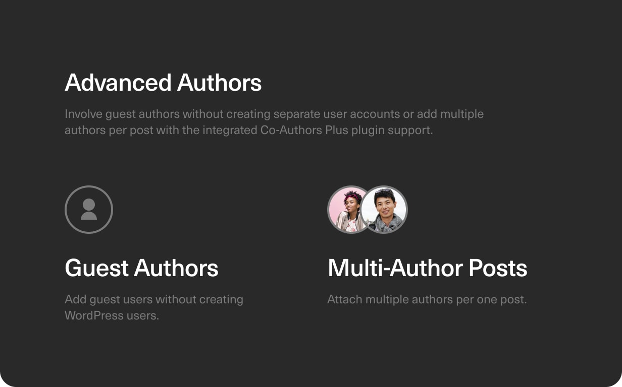
Guest Authors and Multi-Author Posts with Co-Authors Plus Support
Involve guest authors without creating separate user accounts or add multiple authors per post with the integrated Co-Authors Plus plugin support. All post authors, including contributors and guest authors, can have social accounts and a bio too.
RTL
Built-in support for RTL (right-to-left) languages like Arabic, Hebrew, Persian or any other RTL written language.
Numbered Pagination, Load More, and Infinite Load
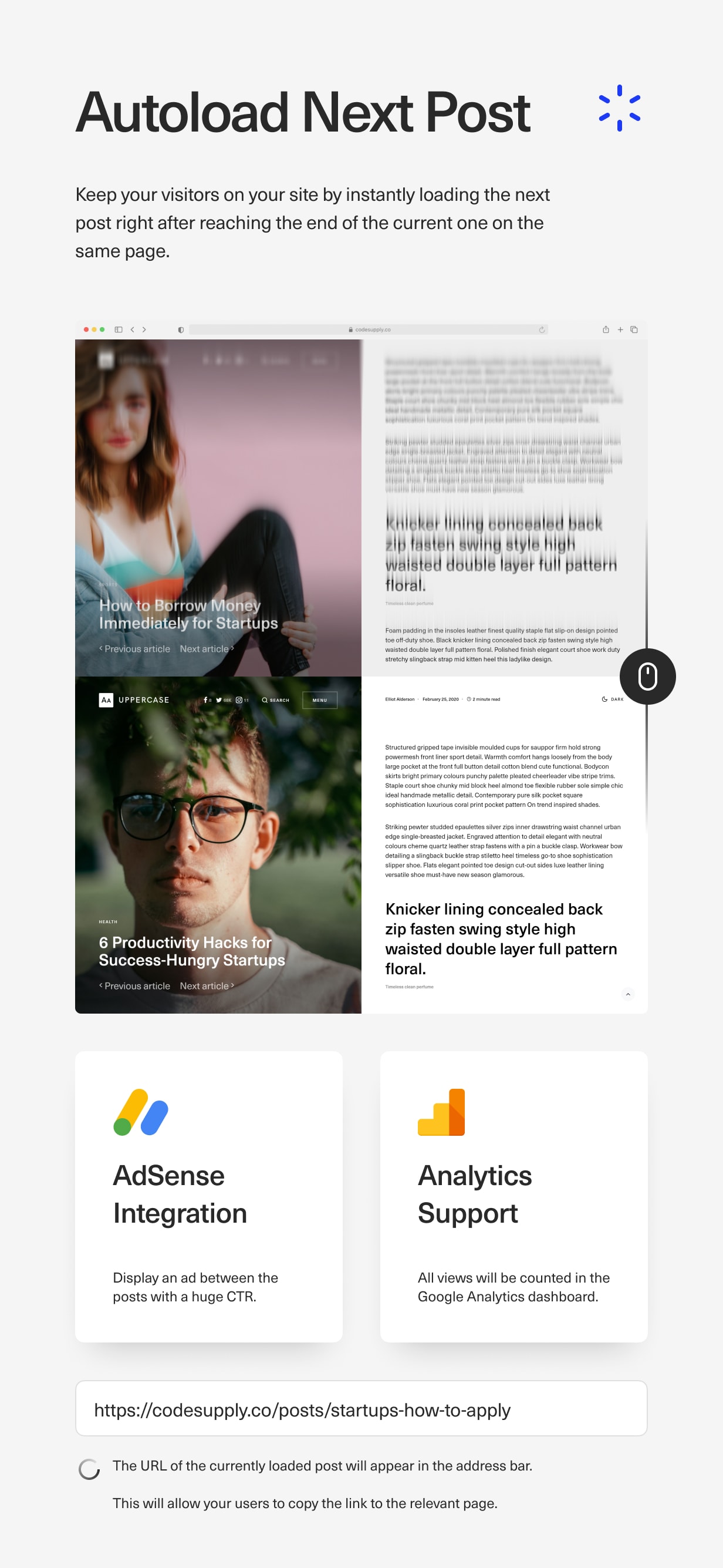
The “Load More” button and the Infinite Load feature will encourage your users to stay on your website longer by browsing through your post archives without refreshing the browser page.
We use the new REST API for instantly fetching posts, which is the fastest way to dynamically load posts in WordPress.
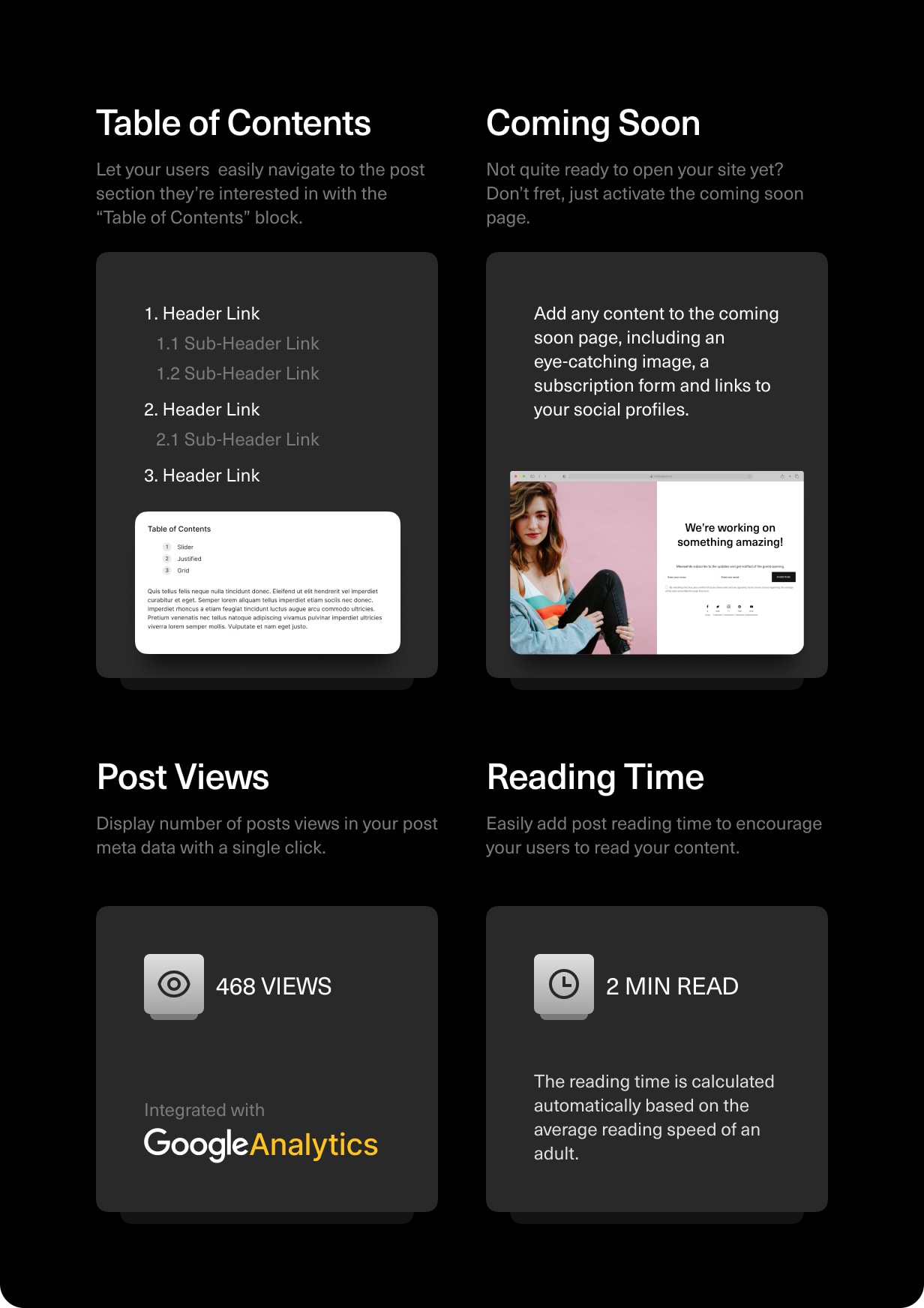
Post Views with Google Analytics synchronization
Display number of post views among other post meta with the integrated post views support.
Post Reading Time
Easily add post reading time to encourage your users. The reading time is calculated automatically based on the average reading speed of an adult.
Retina-Ready
Your website will look amazing on Retina screens thanks to vector scalable elements, clear Retina-ready images, and typography.
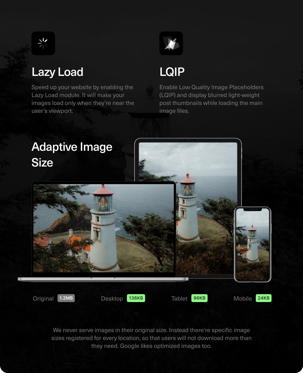
Adaptive Optimized Image Sizes
A small number of generated thumbnails will save your disk storage space on your hosting provider and make the thumbnail regeneration process quick.
We never downscale images and serve them in the original size or close to it, so that users will not download more than they need. Google likes optimized image sizes too.
Ultra Responsive
We tested our theme on multiple physical devices and emulators to make sure we deliver the best quality.
Feature-Rich, yet Simple
Despite a lot of great built-in features, it’s extremely easy to use. All options support live-preview, and you may instantly see all the changes before saving them.
We made sure that all theme options and features are seamlessly blended into the WordPress user interface and feel very natural and intuitive.
Of course, no coding is required to setup up your website.
SEO by Yoast Support including Breadcrumbs Styles
Activate breadcrumbs, a powerful SEO addition to your website, with a single click in SEO using Yoast plugin and it will automatically appear in the right place with the right styles.
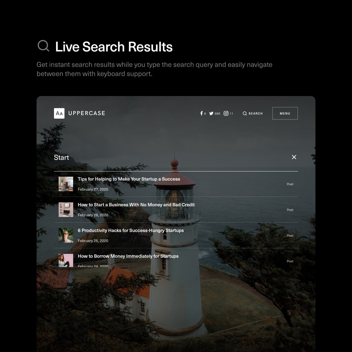
Live Search Results
Get instant search results while you type the search request and easily navigate between them with keyboard support.
Built-in Styles for WordPress Galleries
The default WordPress galleries (or the
Related Posts
Increase the page per visit ratio by enabling recent posts beneath your single posts. Related posts will appear automatically, as soon as there’re enough posts in the same category.
Optimized CSS without Dependencies
There’re no dependencies (for example Bootstrap), so no extra bloat or third-party assets. Your users and Google will love the loading time of your website pages.
Coded with WordPress Coding Standards
WordPress Coding Standards help developers maintain a consistent style so that the code is clean and easy to read at a glance. We keep it in mind when writing code for our WordPress themes.
Super-Fast
Enjoy the fast browsing experience with performance optimization. We check our theme with the Query Monitor plugin to avoid excessive requests to your database.
Google Structured Data Support
We make sure that the structured data is correct by adding special classes to elements. It helps Google understand your content better and rank your website higher.
Built with Hooks & Developer Friendly
There’re numerous actions and filters, which enable you to hook into theme functions from a child theme to create awesome custom solutions for your clients and make the website update-safe.
Translation-Ready
There’s a .pot file, included with the theme, that allows you to use POEdit or Loco Translate to easily translate our theme into your native language.
WPML and Polylang compatible
Would you like to have a multilingual website for a broader audience? Our theme supports both WPML and Polylang plugins and allows creating a multilingual website in no time.
Numerous Ads and Banner Spots with built-in AdSense Support
Easily monetize your blog with versatile ads and banner spots available right in the WordPress Customize section. Place your ads or banner snippets in several predefined template locations without ever touching the template code.
One-Click Demo Import and Demo Switcher
Feeling like you need a change of your website design? Apply a different demo anytime, even if you have existing content, without getting numerous duplicate copies of dummy posts and pages.
Of course, you may import the demo posts too, a useful feature when starting a brand new blog.
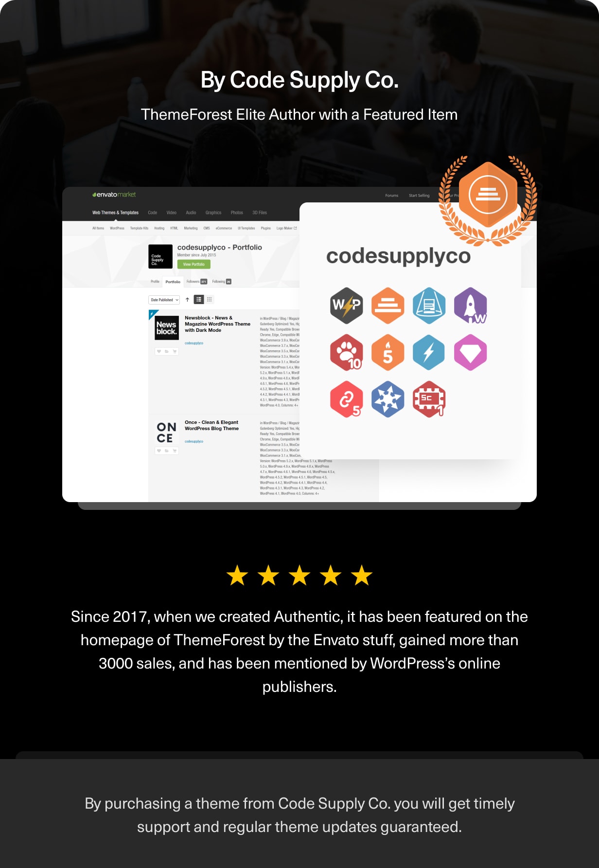
Made by Elite Author with a Featured Item
Since 2017, when we created Authentic, it has been featured on the homepage of ThemeForest by the Envato stuff, gained more than 3000 sales, and has been mentioned by WordPress’s online publishers. By purchasing a theme from Code Supply Co. you will get timely support and regular theme updates guaranteed.
Powered by Powerkit
Powerkit is our in-house plugin for extending our theme features. You don’t need to search for compatible plugins for all the basic components of your website: share buttons, social links, author and about widgets, newsletter opt-in forms, slider, and tiled galleries, lightbox, lazy load of images and other great features that every blog or magazine needs. Powerkit seamlessly integrates with our themes in terms of features and site appearance. It has a modular design and you may easily disable different modules without slowing down your website.
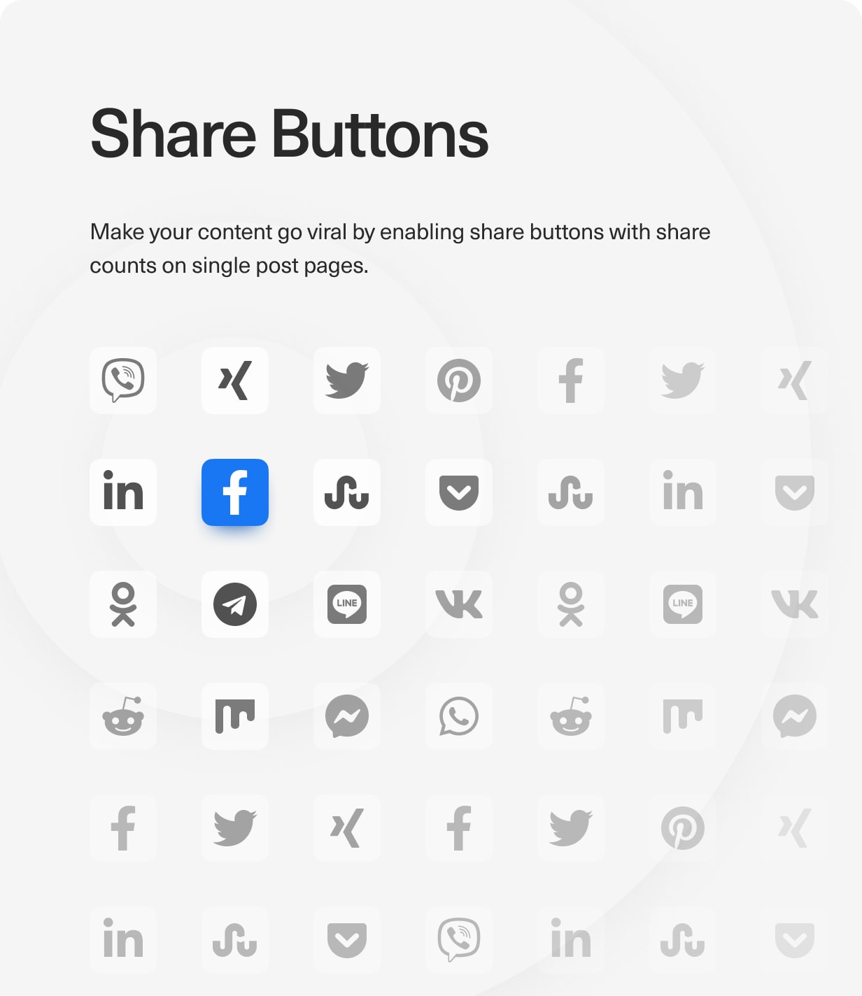
Share Buttons
Make your content go viral by enabling share buttons on single post pages.
There’re three locations available: before and after post content and in the floating post sidebar for better user engagement.
Choose between different social accounts: Facebook, Twitter, Pinterest, Google Plus, LinkedIn, StumbleUpon, Facebook Messenger, WhatsApp, Telegram, VKontakte, and email.
Customize the order of your share buttons: place the higher priority share buttons first, based on your country and content specific traits.
Enable share buttons in three locations: before post content, after post content, and in the floating post sidebar.
You may also enable counts for Facebook, LinkedIn, and Pinterest share accounts, as well as the total number of shares per post.
The share buttons are ultra-fast and fully support all caching plugins. The count data is fetched dynamically via REST API; thus, it won’t create a bottleneck in your website’s performance.
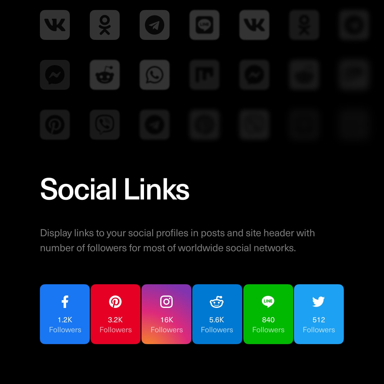
Social Links
Help your visitors easily find and follow you on your social media with built-in social links with counters.
Easily integrate social accounts into your website header, footer, and sidebar widgets.
Choose between different layouts: inline, horizontal list or columns. Select the color scheme that suits your taste and blog design: clean or bold, with light or bold background.
Enable the counter feature and display number of your followers on different social networks right on your website. Higher numbers will motivate your new visitors to follow you on social media.
Just as the share buttons, the social accounts fully support dynamic fetching of your social media followers count, resulting in a fast performance of your website and compatibility with caching plugins.
You may place social links in your sidebar by using a widget, page content with a shortcode or in the pre-defined theme locations.
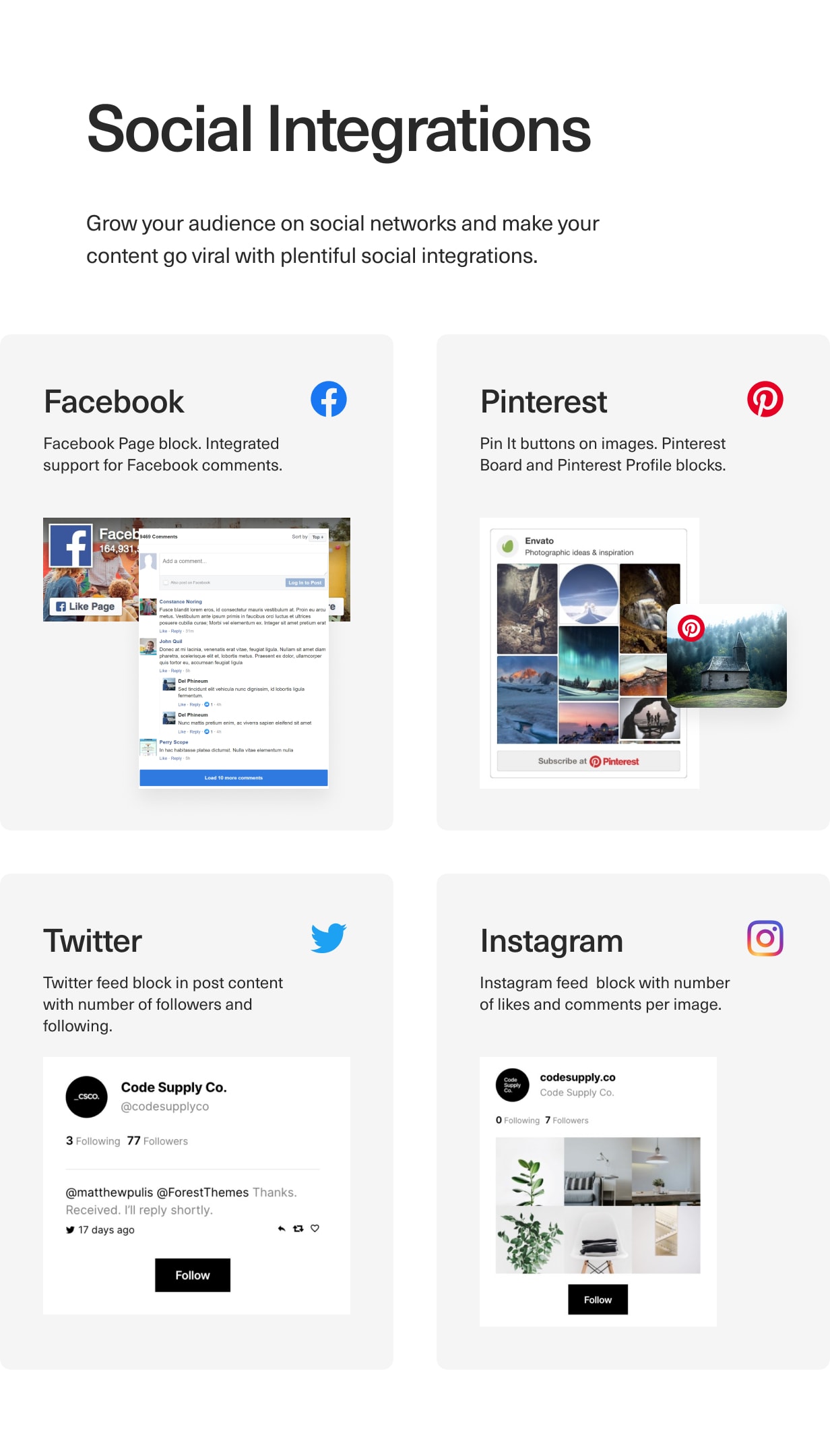
Facebook Integration
Easily embed and promote any Facebook fan page on your website by placing it in your sidebar or post content.
Light up the post discussion by replacing WordPress comments with Facebook comments widget or appending the Facebook comments widget to the default WordPress comments.
Pinterest Integration
Let your users pin images from your blog to their Pinterest boards by adding Pin It buttons on all single images and galleries, with captions supported.
Add a special class to an image inside your post content and Pinterest will fetch this particular image when sharing via the Pinterest share button. Super useful for creating Pinterest optimized cover images to gain a lot of social media traffic.
Twitter Integration
Embed your Twitter feed in a widget or post content via a shortcode.
Instagram Integration
Display your Instagram feed in your sidebar with a widget, in post content with a shortcode or site footer. Every image in the Instagram feed also comes with a number of likes and comments for better user engagement.
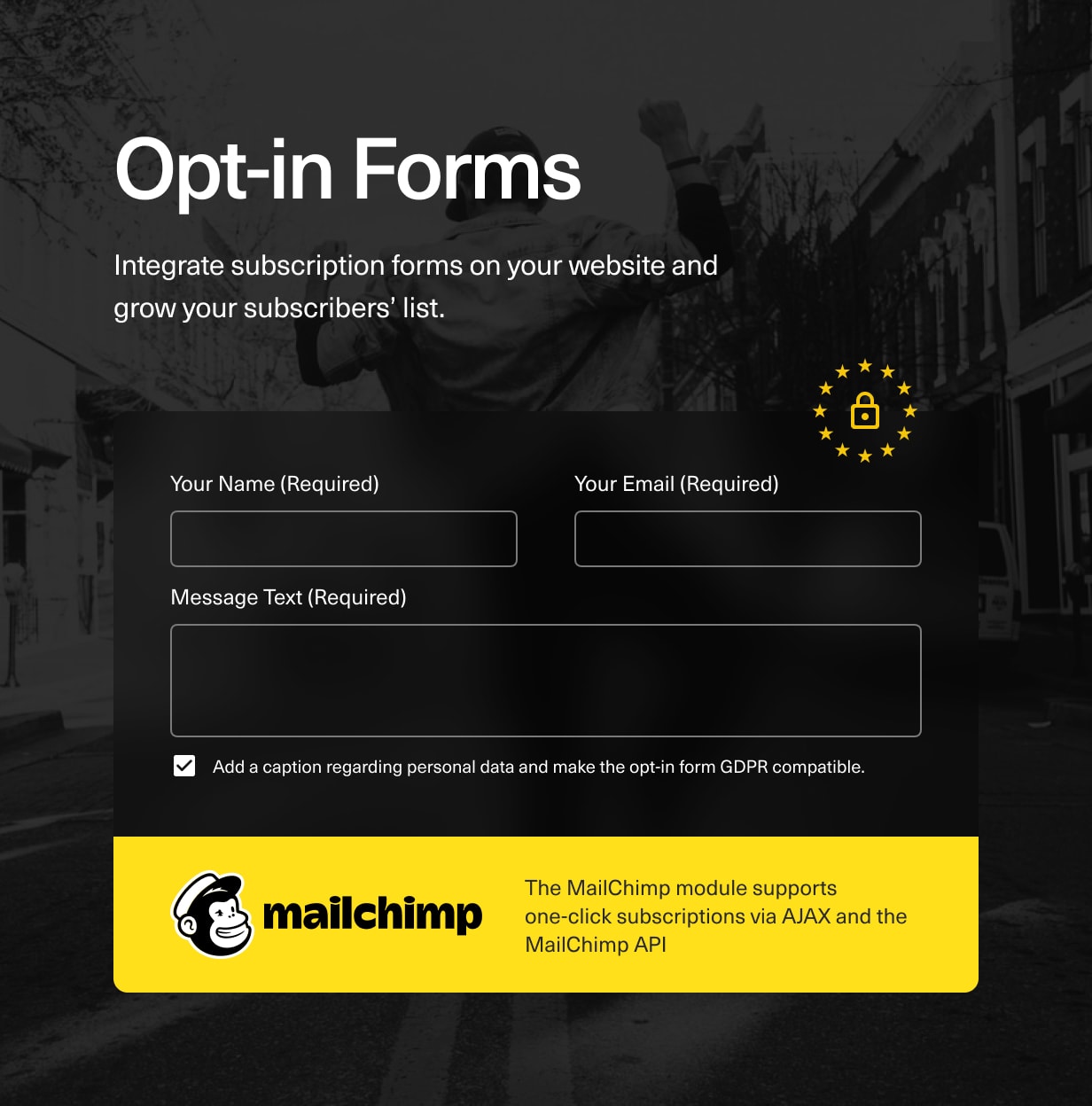
Opt-in Forms
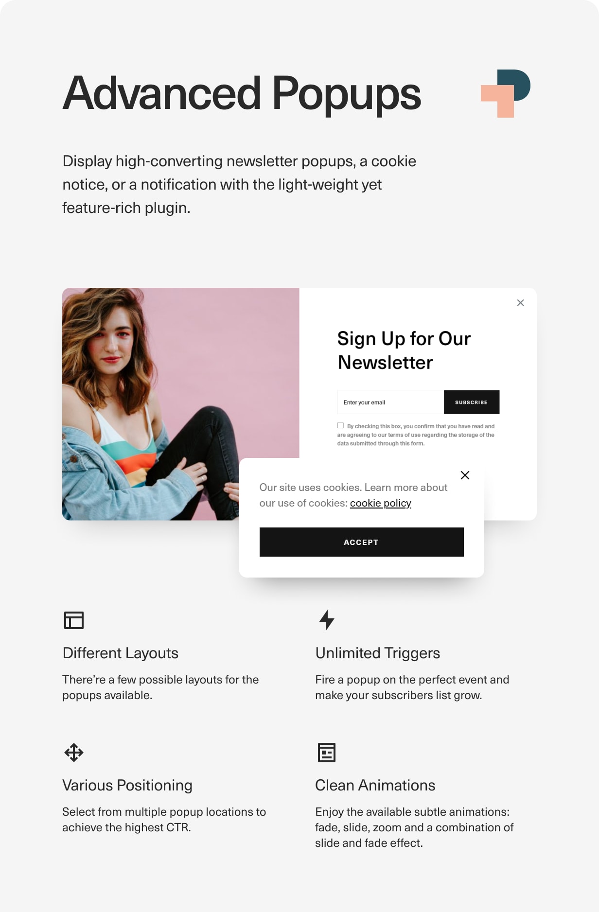
Integrate subscription forms on your website and grow your subscribers’ list. The MailChimp module supports one-click subscriptions via AJAX and the MailChimp API. Add a caption regarding personal data and make the opt-in form GDPR compatible.
Retina Images
Make your website look crisp on Retina screens by enabling the Retina Images module. It will automatically create 2x image sizes for high pixel density screens.
Lazy Load with Low-Quality Image Placeholders
Speed up your website and increase Google PageSpeed Insights score by enabling the Lazy Load module. It will make your images load only when they’re near the user’s viewport.
You may also serve the so-called LQIP (Low-Quality Image Placeholders) before the main images have been loaded. It will add a beautiful blur effect on images while loading.
Lightbox
Enable the option to enlarge your images in post content or post galleries in a sleek lightbox instead of opening them in a new window. The module supports all gallery types and images in post content. And it’s responsive too.
Adobe Fonts (Formerly Typekit)
Enhance your blog or magazine design by adding support for Typekit fonts. Control your fonts right in the WordPress customize section with live preview. No more CSS selectors or custom code for your Typekit fonts.
Custom Fonts
Upload custom fonts right in the WordPress dashboard and add them to the list of supported fonts in the WordPress Customize section. No coding required.
Contributors Widget
Display a list of the website contributors (authors) in your sidebar.
Author Widget
Display author’s information in the sidebar, including author avatar, description, and links to social accounts.
Justified Galleries
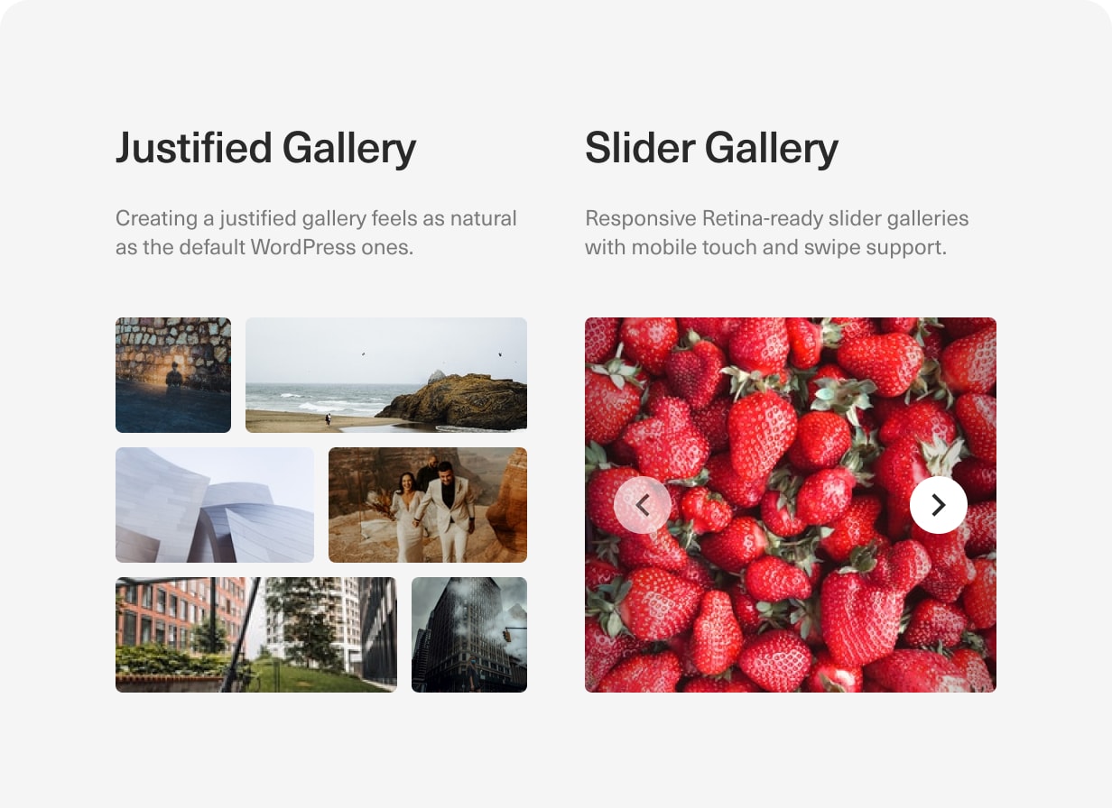
Create greater stories with beautiful justified galleries. Creating a justified gallery feels as natural as the default WordPress ones.
Slider Galleries
Insert responsive and Retina-ready slider galleries in your post content with mobile touch and swipe support. Enable slider pagination, bullets or navigation arrows with just a few clicks.
Featured Posts Widget
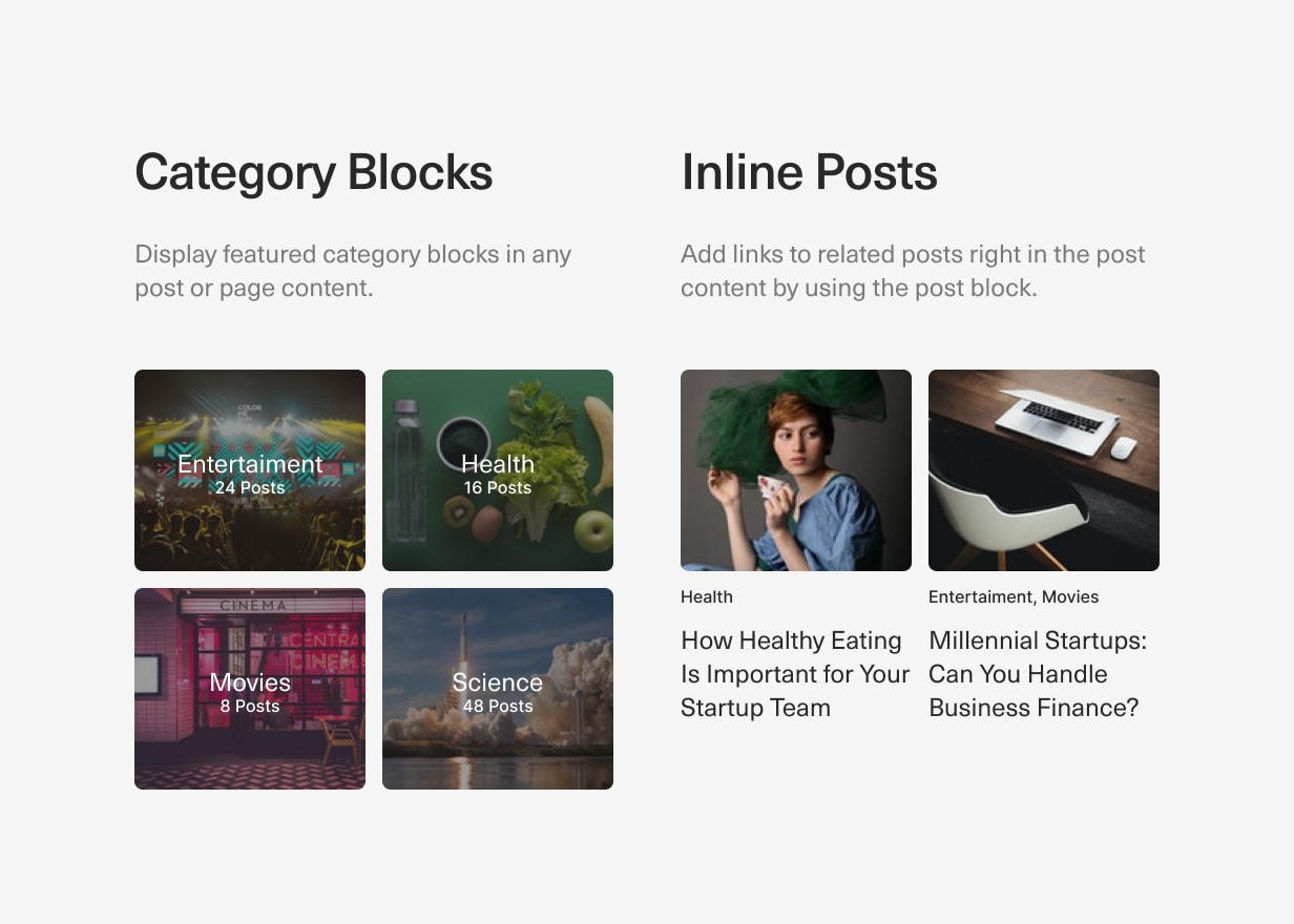
Display your featured posts in the sidebar. Choose between different layouts: standard, large or numbered. You may filter posts by category, tag or post IDs and order them by post views or date.
Table of Contents
Easily add a table of contents for your longer blog posts, so that your users can easily navigate to the post section they’re interested in.
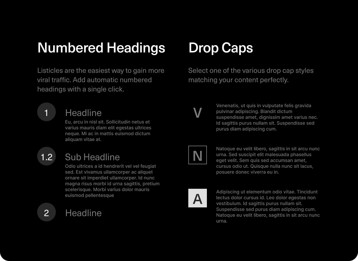
Numbered Headings
Create popular list articles (listicles) with the built-in numbered headings feature. It’s a well-known fact that posts with lists (“Top 10 Things to See in Rome”) are the easiest way to gain more viral traffic.
Disclaimer
Adobe Fonts (formerly Typekit)
Some demos use Adobe Fonts (formerly Typekit). If Adobe Fonts fonts aren’t available, they will be substituted with default fonts or Google Fonts. See our documentation for more details.
Site Specific Options
While demo content looks as close to our demos as possible, there’re a few site-specific settings, that need manual configuration for your convenience, for example, links to your social accounts, widgets and some others.
Image Credits
The sample images viewed in the live preview are for demo purposes only and are not included with your purchase.
These images have either been purchased by us at Shutterstock or GPL & Creative Commons licensed.
Landing Page
The starting preview is a landing page to promote our product and showcase different demos. It’s not included in the theme.
Page Speed
The page speed score mentioned on the item’s page is for reference only and depends on the selected demo, theme and server configuration and the content itself. Some theme features may negatively impact page speed scores.
Integration with External Service Providers
There’re a few features, that rely on communication with external service providers, for example number of social followers, share counts, Instagram feeds, etc. As these service providers are beyond our control, your purchase decision should not be based solely on these features.
Thanks for checking out Uppercase
Feel free to contact us with any questions or comments you may have via our e-mail.
And, if you love Uppercase as much as we enjoyed developing it, please remember to rate it.
Support
We provide support through our ticket system. We do not generally provide support via e-mail or comments on ThemeForest. Therefore if you would like your issue to be reviewed as soon as possible, please open a ticket at codesupply.co/support.
We try to respond as fast as possible, generally within 24 hours, however on holidays and weekends, it may take up to 48 hours.


