My Mobile Wordpress Theme - Rating, Reviews, Preview, Demo & Download

Theme Description
My Mobile Page V2 Wordpress Theme
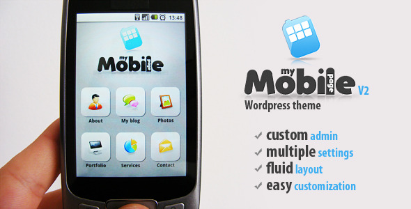
My Mobile Page V2 Wordpress Theme is a unique wordpress mobile theme with some amazing new features, 100 % customizable, fluid layout, automatically resized to every mobile resolution, auto device orientation resizable, custom admin panel
VIDEO PREVIEW
Updates on how to use the mobile detection code and theme switcher plugin
3 easy steps:
- Go and download THIS wordpress theme swicher plugin and install it like a regular plugin.
- Go and download THIS mobile detection code and copy the file to your “desktop theme” root folder. Where the header.php file is also.
- Open you “desktop theme” header.php file and right at the top include this code:
<?php
include("Mobile_Detect.php");
$detect = new Mobile_Detect();
if (!$_SESSION['switched']
&& !is_admin()
&& $detect->isMobile()
&& empty($_REQUEST['wptheme'])
&& get_current_theme() != 'My%20Mobile%20Page%20V2') {
$_SESSION['switched'] = true;
header('Location: http://yourwebsiteurl.com?wptheme=My%20Mobile%20Page%20V2');
}
?>
Make sure you write your wordpress website url corectly here: “http://yourwebsiteurl.com”
Also if you modify the mobile theme name (theme name must be change also from style.css file of the mobile theme) make sure you change also “My%20Mobile%20Page%20V2” from the code
IMPORTANT : The desktop theme must always be the one left active from your wordpress admin. After you download the mobile theme, activate it, add all the content to it, make all the settings you want, and after that deactivate it and activate the desktop theme again.
Now go and test it with your mobile. The desktop theme will stay active for desktop users, and the mobile on will be activated only when the user is coming from a mobile device.
Main Features
- Fluid layout that will automatically resized to every mobile resolution
- Auto device orientation resizable
- Custom admin panel from where you can:
- Add your custom logo image
- Customize home menu icons, adding new icons thru custom post types
- Disable / Enable custom buttons and sections from the theme
- Easy create a new blog page
- Easy add photos in gallery page
- Easy create services and portofolio page sections thru custom shortcodes
- Manage social icons
- Customize contact page settings
- SEO Friendly code
- Optimized CSS code
- jQuery effects
- Contact Page with working contact form
- Layered Psd Files
- HELP files included
Reviews & Comments
You must be logged in to post a comment.


